While designing your own product based ecommerce website (FMCG, Skincare, Apparel and others), you will have lot of creative ideas (along with your creative agency) for the website to make it better, personalised, interactive and conversion oriented.
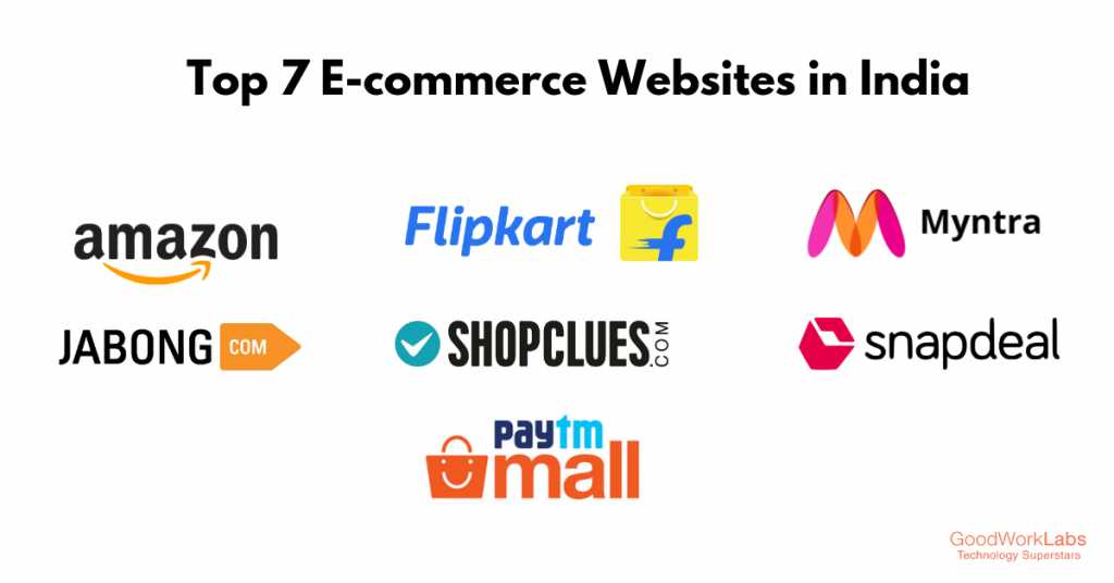
Depending on the no of product range, you do the categorisation and create the flow/architecture (SEO emanates from there in fact), the UI, communication, discount and the check out process. I am not suggesting to get inspiration for the entire Ecommerce architecture of Flipkart or Amazon. Since this is not applicable for your kind of business, product or communication.Some examples are as follows:
- The search bar could be of different, if the no of products are less say only 30 products
- The design of the content sections would be different – since you are a new player, you may focus on content based SEO operation
- If the products are of Unique category/Or new to the market, there could be a different presentations altogether and that depends on the UI/UX team, marketing analyst team.
What I wanted to put an emphasis to follow certain areas of the giant ecomm platforms:
- The whole check out process
- The discount module
- The banner modules which is always customised and could be changed as per the objective
- The payment options
- The Shipping journey experience – emails, massaging, notifications etc
I have seen while being associated with few of the Ecommerce projects/brands, they try to evolve a whole new wheel of the above modules. But why?
- These platforms have evolved and improved the experience from years
- People have adopted the flow of these and quite used to it. Why to break the conventional form of check out and other user experiences.
- The colour aspects of the different buttons (not the brand color)
Looking for your valuable comments and insights.